Editor Overview
Understand the visual editor layout, toolbars, panels, and how to navigate between pages.
The Visual Editor is the design workspace where you build and edit your website. It combines a live preview canvas with side control panels, enabling you to inspect the page hierarchy, apply themes, and configure settings.
Open the editor by clicking Edit Site on a site card to open the Site Details page, then click the Open Editor button in the top-right corner. Alternatively, click the Edit button next to any page in the page list.

Editor Layout
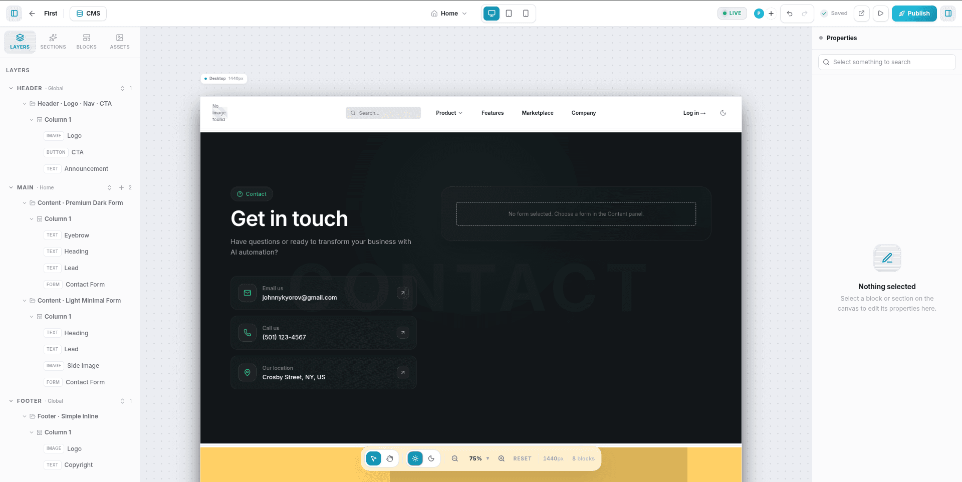
The editor interface is divided into five functional areas:
┌──────────────────────────────────────────────────────┐
│                   Top Toolbar                        │
├────────────┬─────────────────────────┬───────────────┤
│            │                         │               │
│  Left      │       Canvas            │  Right        │
│  Sidebar   │   (live preview)        │  Sidebar      │
│            │                         │               │
│  (Layers,  │                         │  (Properties, │
│   Library) │                         │   Styles)     │
└────────────┴─────────────────────────┴───────────────┘
│                  Bottom Toolbar                      │
└──────────────────────────────────────────────────────┘
Top Toolbar
The Top Toolbar houses global site controls, view toggles, collaboration tools, and publication settings.
| Control | Description |
|---|---|
| Page Switcher | A dropdown to switch between pages or quickly create a new page with its slug route. |
| Device Switcher | Toggles the active canvas viewport between Desktop, Tablet, and Mobile sizes. |
| Undo / Redo | Reverts or re-applies canvas changes. Supports keyboard shortcuts Ctrl+Z / Ctrl+Shift+Z (Cmd on Mac). |
| Auto-Save Status | Indicates whether the canvas is fully synced. Displays Saved (with a green checkmark) or Saving... (with a loader) as changes occur. |
| CMS Button | Opens the Database panel to manage Collections, collection items, and site-wide global variables. |
| Collaborators | Displays the avatars of other team members currently editing this page in real-time. |
| Share Site | Allows inviting other users to collaborate on the project. |
| Preview Mode | Opens a interactive read-only mode to test links, buttons, and animations. |
| Publish | Creates a new version snapshot and deploys your changes to the live domain. |
| Sidebar Toggles | Collapses or expands the Left and Right sidebars to maximize your workspace. |
Left Sidebar
The Left Sidebar is your resource panel. It is divided into four tabs:
1. Layers
A hierarchical tree representing all sections and blocks on the current page.
- Select: Click any layer to highlight it on the canvas and open its settings.
- Reorder: Drag elements up or down in the tree to move them on the page.
- Delete: Click the trash icon next to a block or section layer.
- Quick-Add: Click the + (plus) icon next to a section layer to open a search menu and drop a block directly inside it.
2. Sections
A library of prebuilt section templates categorized by purpose (such as Heroes, Features, Pricing tables, CTAs, and Forms). Click a section template to append it to the page.
3. Blocks
A collection of individual elements (such as Headings, Images, Paragraphs, Buttons, Videos, and custom Form fields). Click any block to insert it into the active section or column.
4. Assets
Your media library. Upload images or documents here. Select images from this panel or click them to update selected image placeholders on the canvas.
Right Sidebar (Properties Panel)
The Right Sidebar adjusts dynamically depending on your active selection.
- When a Block is selected: It renders three customization tabs:
- Content: General settings (text copy, button link destinations, or image sources). Next to bindable content fields, click the database link icon to select global variables or CMS collection item fields.
- Styles: Typography, colors, spacing (margins and paddings), border rounding, and box shadows.
- Animations: Entrance transitions (e.g., Fade, Slide, Zoom, Bounce) along with duration, delay, easing, and trigger conditions (On Load, On Scroll, On Hover).
- When a Section or Column is selected: It renders two customization tabs:
- Section/Column: Layout alignment, labels, and column widths.
- Content/Theme: Theme presets, custom HSL palette overrides, background configurations (Solid colors, Gradients, or Image overlays), and dynamic list bindings.
- When nothing is selected: The sidebar displays a clean Empty State prompting you to select a block or section on the canvas.
Bottom Toolbar
The Bottom Toolbar contains canvas navigation tools, UI toggles, and page diagnostics.
| Control | Description |
|---|---|
| Select Tool (V) | The default tool for selecting, moving, and double-clicking elements. |
| Pan Tool (H) | Allows dragging and scrolling the canvas area freely without selecting elements. |
| Theme Toggle | Switches the editor interface between Light and Dark modes. When in Preview Mode, this toggle instead switches the live preview of your website between light and dark modes. |
| Zoom Controls | Scale the canvas between 25% and 300%. Click the Reset button to snap back to 75%. |
| Diagnostics | Displays the current canvas width in pixels (e.g., 1440px, 768px, or 390px) and the total Block Counter for the page. |