Forms
Collect visitor data with no-code forms — configurable fields, spam protection, and a built-in submissions inbox.
Every site can have one or more custom forms. TDC Site Builder handles form rendering, validation, spam protection (honeypot + reCAPTCHA), and stores every submission for you.
Overview
The Forms Dashboard and Form Builder allow you to build complex visitor contact forms, event registrations, or surveys without writing a single line of code. All submissions are saved to a central inbox, where you can search, filter, and export them as a CSV file.
Creating a Form
To create a new form for your website:
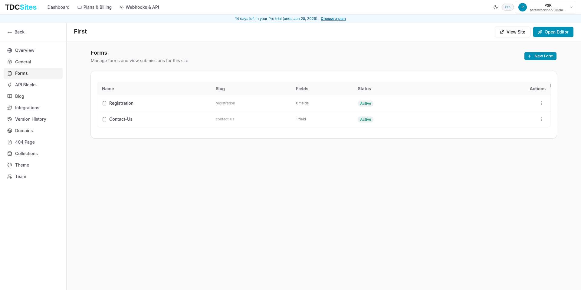
Navigate to your Site Management dashboard and select the Forms tab in the left sidebar.
Click the New Form button in the top-right corner.
In the dialog that appears, give your form a name (e.g., Contact Us or Newsletter Sign-up) and click Create Form.
Once created, the form appears in your Forms list showing:
- Name: The display name of your form.
- Slug: The unique URL-safe identifier for the form's API endpoint (e.g.
/contact_us). - Fields: The number of input fields configured.
- Status: Whether the form is currently active and accepting submissions.
Click the Manage button (or the three-dot menu ⋮ and choose Manage) to navigate to the Form Detail page.
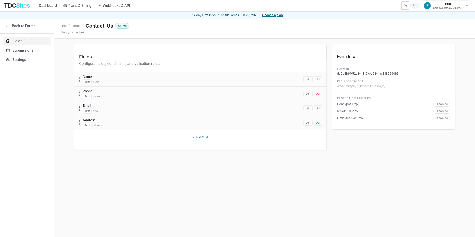
The Form Detail Page & Navigation
Clicking Manage redirects you to a dedicated management interface for that specific form. At the top of the interface, you can view the parent site name and the current form name, alongside its active status badge and slug.
The left-hand navigation allows you to switch between three core tabs: Fields, Submissions, and Settings.

1. Fields Tab
The Fields tab is where you structure your form layout by adding, configuring, or reordering inputs.

Supported Input Types
TDC Site Builder supports a wide range of input types to gather structured data:
| Type | Best Used For |
|---|---|
| Text | Single-line text fields (e.g., First Name, Company Name). |
| Email addresses (performs automatic format validation). | |
| Phone | Telephone numbers. |
| Number | Numeric values (performs format validation and enforces min/max values). |
| Textarea | Multi-line text boxes (e.g., Message, Feedback). |
| Dropdown | Select-list dropdown where users pick one option. |
| Radio | Option lists where users pick one choice. |
| Checkbox | Single toggles (e.g., "Accept Terms") or multiple selections. |
| Date | Date selection widget. |
| File upload | Letting visitors attach files. |
| Hidden | Stashing tracking codes or context values invisible to the user. |
Field Configuration Settings
Each field can be customized with these properties:
| Property | Description |
|---|---|
| Label | The text displayed next to or above the input field on the page. |
| Field Name (Key) | The unique JSON property key for this field (e.g., full_name). It is automatically slugified from the Label, but you can customize it. |
| Type | The kind of input field (e.g., Text, Email, Number, Dropdown). Changing this updates the rendered input style and validation rules. |
| Required | When enabled, the form cannot be submitted without a valid value in this field. |
| Width | Choose between Full Width (takes up the entire line) or Half Width (enables compact side-by-side elements). |
| Placeholder | Default light grey text shown inside the input before the visitor types. |
| Default Value | Pre-fills the field with a default value. |
| Options | For Dropdown and Radio fields, add custom label-value pairs for choices. |
Validation Rules
For advanced fields, you can configure granular validation rules:
- Min Length: The minimum number of characters required.
- Max Length: The maximum number of characters allowed.
- Regex Pattern: A standard regular expression pattern (e.g.,
^[A-Z]+$) to enforce strict formats.
- Min Value: The lowest number allowed.
- Max Value: The highest number allowed.
- Min Length: The minimum digit count.
- Max Length: The maximum digit count.
Reordering Fields
To reorder fields, click the up (▲) and down (▼) arrow buttons on the left of any field row. The order changes instantly and is synchronized with the form layout.
Editing & Deleting Fields
To modify or delete a field, use the action buttons on the rightmost side of the field row:
- Edit: Opens the field configuration editor inline where you can adjust properties or validation rules. Click Save field to apply changes.
- Del: Permanently removes the field from the form layout.
2. Submissions Tab
The Submissions tab displays all entries sent by visitors in real-time.
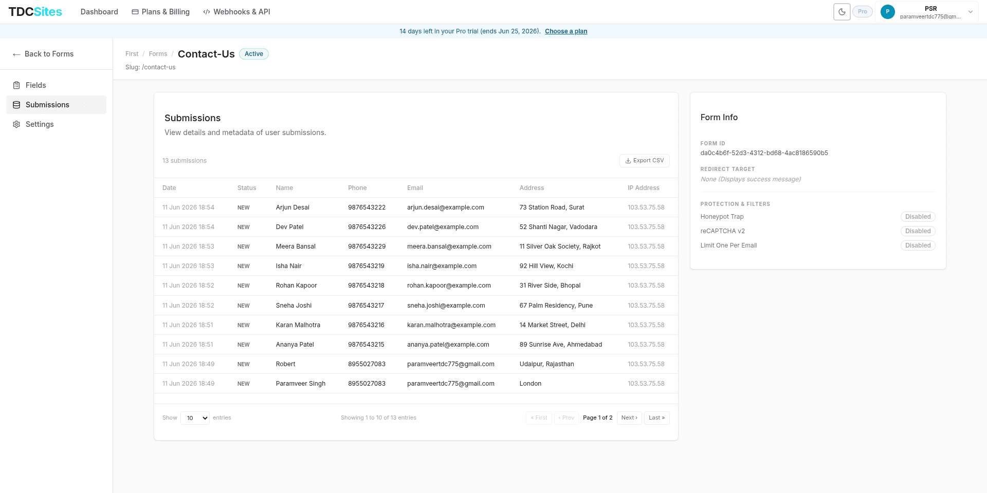

Viewing Entries
Each entry is displayed as a row containing:
- Date/Time: The date the form was submitted, formatted to your local timezone.
- Status: The submission status (e.g.,
NEW,read, orspam). - Field Data: Every custom field value submitted by the user. The table columns scale dynamically to show each field defined in your Fields tab.
- IP Address: The client IP address of the submitter.
Exporting as CSV
Click the Export CSV button to download a spreadsheet-friendly CSV of all form submissions. The CSV includes additional metadata:
- Exact date and time (ISO format)
- Status
- All custom field columns
- IP Address
- User Agent (Browser details)
- Referrer URL (The page the submission originated from)
Pagination & Rows
Use the page navigation buttons at the bottom to paginate through entries. You can choose to display 10, 20, 50, or 100 entries per page.
3. Settings Tab
The Settings tab lets you control the behavior of your form after a visitor submits it, as well as customize spam protection and status.
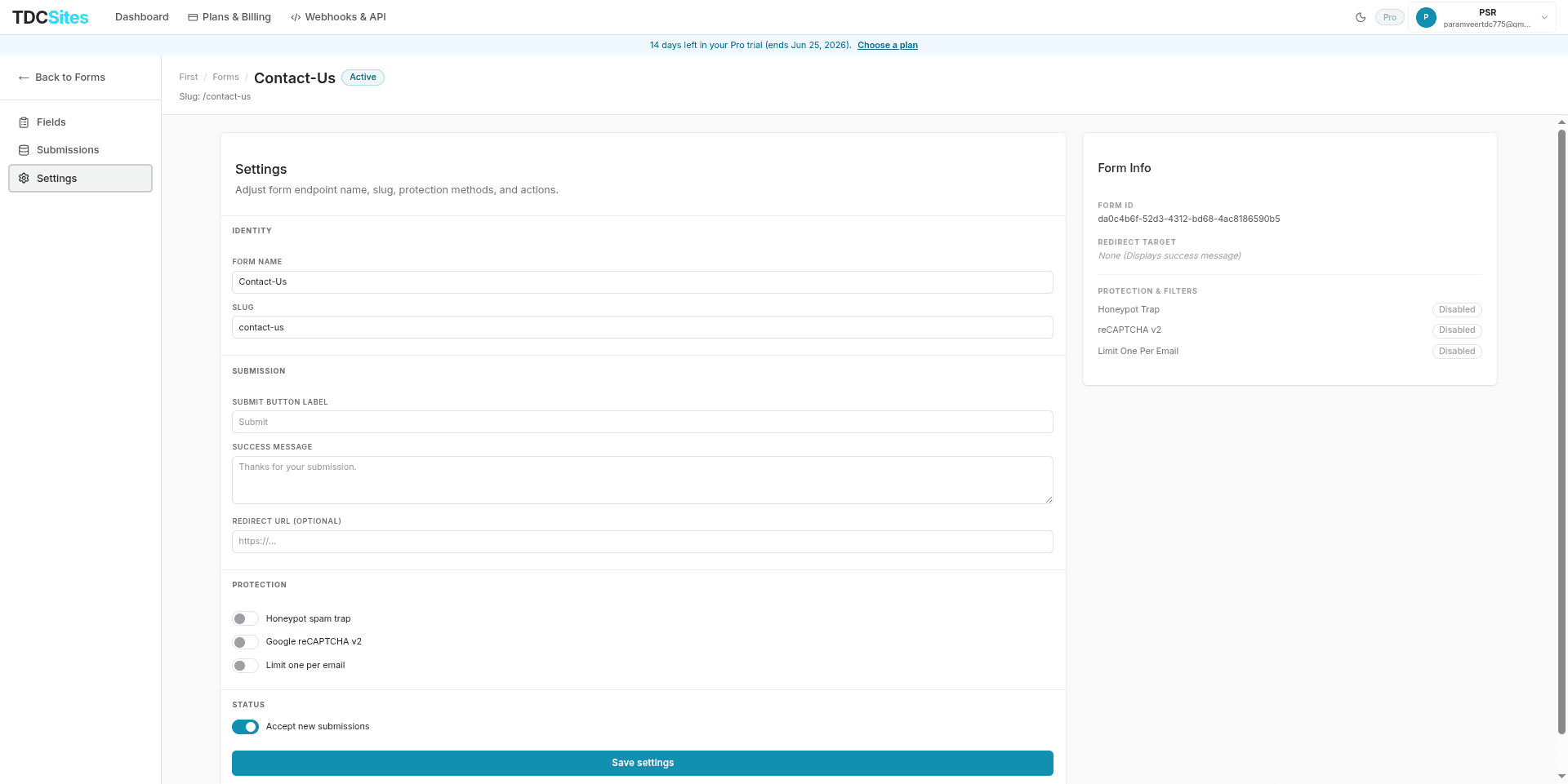

Identity
You can update your form's unique identifiers under this section:
- Form name: Modify the human-readable display name used to identify the form within your dashboard.
- Slug: Update the URL-safe endpoint path (e.g.,
/contact-us). Changing this updates the destination address for API submission queries.
Submission Actions & Redirection
You can configure what happens after a successful submission:
- Submit Button Label: Customize the text on the submit button (e.g.
Send Message,Join Waitlist). - Success Message: A text message shown directly on the page to visitors after a successful submission (e.g., Thank you! We'll be in touch.).
- Redirect URL: Instead of a success message, redirect users to a custom URL (e.g. a personalized
/thank-youpage or an external site).
Spam Protection & Filters
We provide robust, built-in security features to protect your forms from spam and bots:
| Feature | How It Works |
|---|---|
| Honeypot Trap | Inserts a hidden form field that is invisible to human users but filled out by automated spam bots. If a bot fills it out, the submission is silently rejected (the bot receives a fake success message, but no data enters your inbox). |
| Google reCAPTCHA v2 | Adds standard Google reCAPTCHA checkbox verification to the form. Note: Requires RECAPTCHA_SECRET_KEY to be configured in your environment variables. |
| Limit One Per Email | Prevents multiple entries from the same email address. Checks the form's past submissions for matching email field values and blocks duplicates. |
Form Status
Use the Accept new submissions toggle to open or close the form. When disabled (Inactive), the form will reject all incoming payloads and will not accept submissions.
Embedding a Form on a Page
Once your form is configured, you can embed it on any page of your site:
Go to the Overview tab of your site and click Open Editor next to the page you want to edit.
In the left sections library, locate the Forms category (or add a Form Block from your blocks list).
Select the Form Block on the canvas.
In the Right Sidebar property panel, locate the form selector dropdown and pick the form you want to display.
Publish your site to make the form live for visitors.